Avatar
NewA familiar face for every person. Use initials, icons or images to represent people and teams.
Label
Initials in three sizes, with square and circular shapes.
Square
Circle
Icon
Use the built-in person symbol, an application icon class or an #icon template.
Person
Custom icon
Image
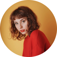
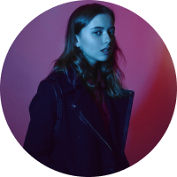
Photos fill the avatar. Supply a label as a fallback if the image cannot load.

AvatarGroup
Group related people with overlapping avatars and an optional overflow count.


Badge and status
Compose an avatar with a count or presence indicator.
Custom content
Project your own non-interactive content when no image, label or icon is set.
Usage and API
import { AvAvatar, AvAvatarGroup } from 'avero-ui';

<av-avatar label="AE" ariaLabel="Amy Elsner" size="large" shape="circle" />
<av-avatar image="amy.jpg" label="AE" imageAlt="Amy Elsner" />
<av-avatar ariaLabel="Team">
  <ng-template #icon><span aria-hidden="true">◎</span></ng-template>
</av-avatar>

<av-avatar-group ariaLabel="Project team">
  <av-avatar label="AE" ariaLabel="Amy Elsner" shape="circle" />
  <av-avatar label="AJ" ariaLabel="Asiya Javayant" shape="circle" />
  <av-avatar label="+2" ariaLabel="2 more team members" shape="circle" />
</av-avatar-group>
Import AvAvatar and optionally AvAvatarGroup. Inputs: label, icon (an application CSS class), image, imageAlt, ariaLabel, size (normal, large, xlarge) and shape (square, circle). Defaults are normal and square.
Content priority is image, label, #icon template, icon class, then projected content or the default person symbol. An image error emits onImageError and falls back to the remaining content. Changing the image source allows a new loading attempt.
Set ariaLabel for initials and icons, or imageAlt for a standalone image. Decorative avatars beside a visible name can use aria-hidden="true". Avatars are not interactive; use a named button or link around an avatar for an action.
Theme with --av-avatar-background, --av-avatar-color, --av-avatar-size and --av-avatar-radius. Group direct avatar children with AvAvatarGroup; customize --av-avatar-group-overlap and --av-avatar-group-border to suit the surrounding surface.
Reference: PrimeNG Avatar.