Galleria
NewA closer look at every detail. Explore images with thumbnails, captions and a full-screen viewer.
Basic
Select a thumbnail or use the arrows to explore the collection.
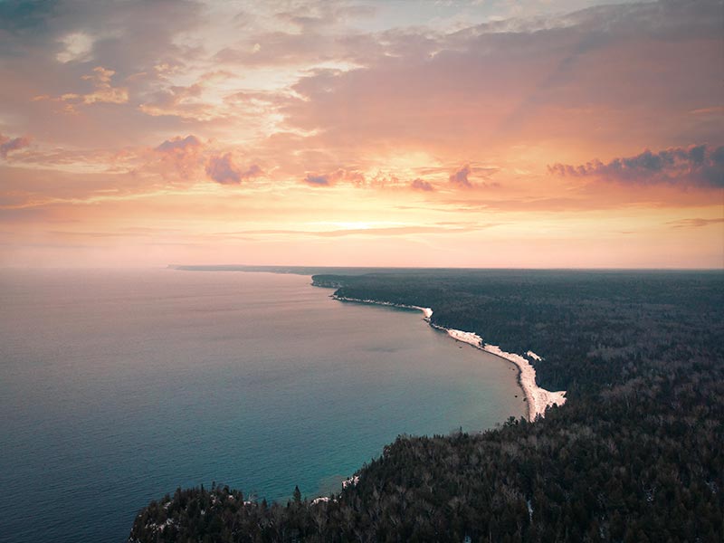
Controlled and thumbnail positions
Choose a thumbnail position or select an image from the external control. Resize the window to see the thumbnail count adapt.
Indicators
Use numbered indicators instead of thumbnails. Arrow keys move between images; Home and End jump to the first and last.
Autoplay
A slideshow that advances every four seconds. Playback pauses on hover, keyboard focus, hidden tabs and reduced motion preferences.
Full screen
Open any image in a full-screen gallery. Press Escape or use the close button to return.
Usage and API
import { AvGalleria } from 'avero-ui';

<av-galleria [value]="images" [numVisible]="5"
  [responsiveOptions]="responsiveOptions" [(activeIndex)]="activeIndex"
  showItemNavigators circular ariaLabel="Travel photographs">
  <ng-template #item let-image>
    <img [src]="image.itemImageSrc" [alt]="image.alt" />
  </ng-template>
  <ng-template #thumbnail let-image>
    <img [src]="image.thumbnailImageSrc" alt="" />
  </ng-template>
  <ng-template #caption let-image>{{ image.title }}</ng-template>
</av-galleria>
Supply value and #item / #thumbnail templates. Both receive the item and index. #caption receives the same context; #indicator receives the index. Provide meaningful alt text on your main images.
[(activeIndex)] controls the zero-based selection. numVisible defaults to 5; responsiveOptions accepts pixel breakpoints and numVisible. thumbnailsPosition and indicatorsPosition accept top, bottom, left or right.
showThumbnails defaults to true. showIndicators, showItemNavigators, showItemNavigatorsOnHover and changeItemOnIndicatorHover default to false. circular wraps navigation; autoPlay enables playback with transitionInterval in milliseconds (4000 by default).
Set fullScreen and bind [(visible)] to open the modal viewer. Focus returns to its trigger when closed. Inline galleries are always visible. ariaLabel names the gallery; --av-galleria-color customizes the accent.
Reference: PrimeNG Galleria.